
Notice something different around here? Like a new look website perhaps?
Yesterday this sexy new thang went live and I’m thrilled because I feel like this has been a long time coming.
It’s been 2.5 years since the ladies at Startsomewhere.com did a great job on bringing my Suitcase Entrepreneur brand to life and it’s served me incredibly well.
So why did I redesign my logo and website?
On my recent webinar I shared with close to 500 people the fundamentals your website or blog needs to do, which are**:**
- attract, convert and sell prospects who visit
- be easy and inexpensive to manage and change (hence why I highly recommend WordPress for any website)
- clearly help your prospects achieve their most desired results.
I realized that while my website and blog has a ton of great and valuable information that people tell me they love, much of the best stuff was hidden and I wasn’t applying my own rules from above.
So I’m going to share with you:
- The key elements your online platform needs to help you build a fantastic online business
- Show you how that relates to my redesign and what I’ve had done
- Tell you how to do this yourself
Sound good? Let’s begin
1. You need a mobile-optimized website
There are absolutely NO excuses these days to not have a website or blog that looks great on mobile, tablet and your laptop. In fact it’s a MUST given that 41% of people open their emails on a mobile and then visit your website.
Don’t believe me then listen to my podcast with Greg Hickman on the importance of mobile and how to start using it effectively and other scary facts on how much people use their phones to do just about everything these days.
What I did
When I checked my Google Analytic stats at the start of this year I was horrified to see that of the 57% of visits coming from my mobile (which is huge) a whopping 70% of them were bouncing – as in coming to the site and leaving straight away because on their phone, all they could see was tiny writing and full web pages that put them off.
As a Suitcase Entrepreneur harping on about the latest tools and technology I also felt ashamed that my site seemed archaic on the responsive mobile optimized front. Now it’s HOT! So now it’s completely mobile optimized.
It also loads a heck of a lot faster on the new theme we’re using which makes a huge difference and a much better user experience for my visitors.
Your Turn:
Take a moment to view this site on your mobile or tablet. Or if you’re viewing this on a laptop or computer play around with your browser window making it smaller and narrower and watch how the content and images respond so you can still read it easily. If it’s not then you need to switch to a mobile responsive platform, talk to your web person about your options or if you’re on WordPress upgrade to a mobile responsive theme.
2. A Compelling Home Page
Your home page has exactly four seconds to impress someone. So it should tell them in four seconds or less exactly where they’ve landed and why they should stick around.
Your homepage should state your “WHY”. It should make people want to sign up straight away for your newsletter.
What I did:
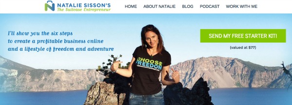
You can see I clearly state my why on mine : “I’ll show you the six steps to building a profitable online business and lifestyle of freedom and adventure.”
The whole aim of the home page redesign was to inject some more fun and personality and an updated image (although still waiting on the ones from a recent photo shoot to come through!). This was actually taken on a road trip with my friend Scott last year on my book tour where we stopped at Lake
Plus I want people to immediately take action to get my starter kit. Below that I let you Choose Your Own Adventure based on what takes your interest, and it’s well aligned to my brand and I’ve always adored the book series by the same name!
Your Turn:
Work on your compelling WHY statement and get started on making your home page one that people understand and makes them want to stick around. Short of joining me on The Freedom Program to do this over the next 8 weeks with me and all the lovely international members, I recommend you work with a designer (see who did my redesign below) or use 99Designs to get your home page done right.
3. An email opt-in form
As I’ve written about before your money is in the LIST! When I first had my blog I had no way of people being able to sign up to hear from me. I didn’t feel right about asking people to give me their name and email so I could communicate with them. BIG MISTAKE.
When I finally did I only emailed them once a month by which time they had forgotten about me and unsubscribed as they weren’t sure why I was in their inbox.
OK slight exaggeration but I truly lost out here by not starting it way earlier and then building trust and a relationship from day one.
So give dangle a truly delicious carrot in your visitors faces that makes them want to give you their email address. Give away your BEST work too – not some flimsy 5 page report that doesn’t help them at all, but true value that people would actually pay for.
What I did:
You’ll see my call to action is clear in the top banner and when you click on it you get this pretty pop up banner to pick up my Suitcase Starter Kit valued at $77 which contains four juicy items I’ve put a lot of love and detail into and that relate to building and online business and becoming location independent and includes an eBook, checklist, audio and email series.
Your Turn:
You can do this yourself by giving away an awesome free download (a video series, a book, an audio, an email series, a whitepaper or the first chapter of something or sneak peak of something you usually charge for.
4. A Start Here or About page
Your About Page is actually the second most visited page on almost every website because if people don’t totally buy into what you’re doing from your home/ squeeze page, they go to this page to find out a little more about you.
Yes you, not someone speaking in the third person about their values. The REAL you – photos and all. What makes you tick, why you care, what makes you unique..quirks and all. This is your story, this is your WHY you do what you do. This allows people to resonate with you as a human being and trust and like you. Perhaps even fall in love with you!
What I Did:
Along with my personal background, corporate career and my entrepreneurial journey on my About page, I have quick facts, stories and photos about my airport security screw-up, my dragon boating escapades with the future Queen of England and my body sculpting and Ultimate Frisbee wins.
I also have a ‘First Time’ page where I tell people exactly what they can find on my site and break it down by topics and areas I know they’ll be interested in – since I know who my ideal audience, reader, customer is. And I’ve learned over time what people want to know, learn and understand. So I make it really easy for them to find it.
I’ve always had these but will be updating them more frequently with this new design.
Your Turn:
Create your about page (or go and update your existing one) with your compelling and personal story that they can identify with and a summary of your best content; maybe that’s just two blog articles, a short video talking about your “Why”, or a short-list of resources (preferably your own) that dive deeper into your topic of “Mediapreneur-ness”
5. A Sales Page
If you don’t want to go broke you need something to sell and a way for people to buy from you. The best way is a sales page with your compelling offer and a BUY NOW button with your own choice of wording like ‘Get it’, ‘Invest Now’, ‘Click here’ or ‘Grab it’.
This button leads to either a PayPal checkout page, or a service like Gumroad or SendOwl that lets people pay and automatically deliver your digital goods or redirects them after payment to get set up for your service or package you’ve offered, or goes through your e-commerce system to sell a physical product.
A more advanced suite of offerings can come later in your website’s life, but you might as well have something on offer right out of the gate, even if it’s a half an hour Skype consultation.
What I did:
I’ve simplified my offerings and removed several from the navigation so that people get driven to products, The Freedom Plan and the Highlyer Club. But more importantly I’ve put these right on the home page as options for people to select and self identify what it is they’re after which I think will make a huge difference.
I’ve also invested a lot more in the most recent sales page design I’ve had done for The Freedom Plan which people have said looks amazing. Expect to see all my product pages getting a refresh over the coming month.
Your Turn:
Get something up on your site for sale! LeadPages comes in handy here for prebuilt sales page templates, email optin and digital products.In my humble opinion this is the perfect choice for the entrepreneur who wants the simplest way to create pages that convert, that require no knowledge of coding or anything technical, or the need for hosting. You just pick one of their templates, put in your text, photo and whatever elements you want in a few clicks, and before you know it you set up to sell.
6. A Contact Page
Some people would disagree with me on this, but you need to be approachable and you shouldn’t make it hard for your visitors to hunt you down and connect with you.
But I think it’s important that your soon-to-be-raving fans can use to connect with you, to give you more insight into what they need, get their questions answered or where sponsors and the media can email you!
What I did:
Nothing here, same contact page but it’s now under the About navigation.
Your Turn:
Set up your contact or get in touch page on your website. On WordPress it’s pretty standard to have it included with any theme you use or buy. Also there are numerous free Contact form plugins you can install too. You can have your virtual assistant field them initially and only send you the important emails that need to be handled by you.
How do you get started yourself?
If you want to build a profitable online business then you need a platform: somewhere to stand out and be found.
This can be as simple as a squeeze page to get people to optin or a sales page that states your offer and has a ‘Buy Now’ button. I believe LeadPages is THE best solution for getting started when you’re not tech savvy and don’t have a website.
Many profitable businesses have been built using these methods – with just one landing page and an email list.
I want you to go one better than that, and build a brand and platform you’ll be proud of for years to come.
This requires a website and ideally a blog. When you’re starting out you probably won’t want to spend too much money, but skimping on website design can be a costly decision in the long run.
It pays to spend more on great design and functionality, or to at least invest in regular upgrades as your business becomes more profitable. Put aside $300-$3,000+ depending upon the level of complexity of design, how feature-rich you want your website to be and your budget.
On that note I’d like to say a HUGE thank you to Douglas Yuen, over at EfficientWP.com who was responsible for this full redesign.
I first met Doug when we were both visiting Cebu, Philippines and who I caught up with in Bangkok at a conference and again in Dallas at the Podcast Movement. He has fully restored my faith in website designers and technicians after my website got destroyed several months ago when I tried to get my previous theme mobile optimized.
[Learn how to avoid this nightmare situation by reading The Ultimate Guide to Saving Your Website – my full blog post story on it complete with actions to take to protect yourself.]
He sat down with me and went through exactly what I needed, what he could deliver and in what timeframe and was really easy to work with, communicated super clearly and regularly and over-delivered. I’m so freaking proud of my website and new look.
So reach out to Doug who specializes in clean responsive design, on a secure, maintained and optimized hosting platform. (Yes that’s right he can even take care of hosting!).
Also big thanks to my main man Filipe, over there in sunny Portugal who’s behind a lot of the designs you’ll see on my website including the beautiful new logo, banners, and social media imagery.
He’s adept at creating consistent and timeless visual layouts that showcase a brand’s concept and vision in a multitude of scenarios and challenges.
You can find him at DesignHandyMan.com
There are naturally things we’re still testing, fixing, changing and pimping out so stay tuned over the next few days and weeks, but for now …
I want to know what you think of my new website and logo?!